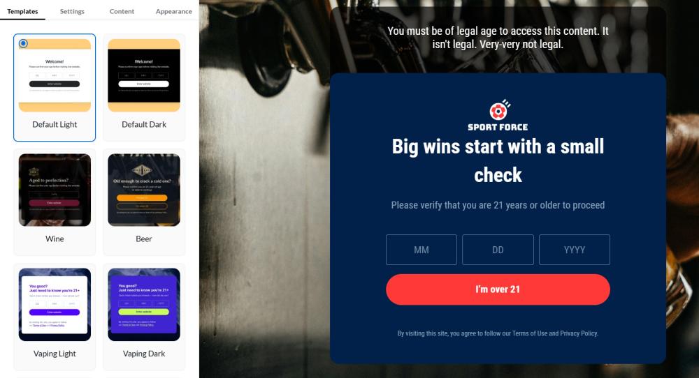
Interface Overview
The Age Verification app interface is divided into two main sections:
- Settings Menu: Located on the left side, this menu allows you to configure various settings for the age verification popup.
- Preview Screen: Situated on the right side, this area displays a real-time preview of how the popup will look based on the applied settings.
To start using Age Verification app, please configure the application by specifying the following settings.
Templates
Choose a pre-built template for your age verification popup. You can customize it to suit your needs, or create a completely new design from scratch.
Settings
Next, open Settings tab. Here, you can specify the following settings:
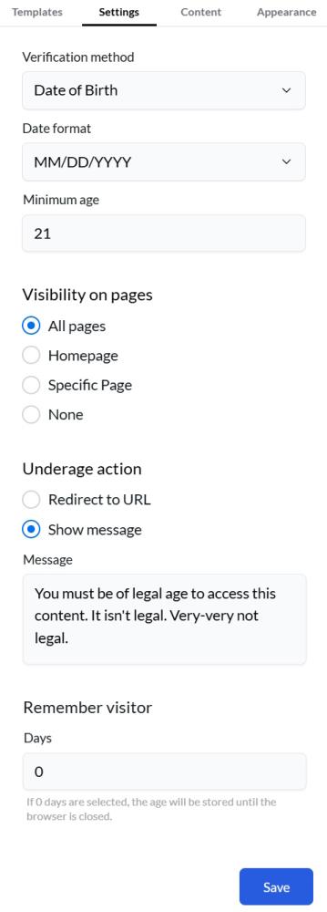
Verification method - choose how you'd like to verify visitors' ages: Yes/No button, Year of Birth, or Date of Birth.
Date format - (for the Date of Birth verification method) specify the preferred date format: DD/MM/YYYY or MM/DD/YYYY.
Minimum age - (for the Date of Birth and the Year of Birth verification methods) specify the minimum age required for users to browse your website.
Visibility on pages - specify where you want to display the age verification popup: All pages, Homepage, Specific Page (enter the URL), or None.
Note
You can display a popup on a group on specific pages by using a wildcard (*). Example: using 'https://example.com/products/*' will display the popup for all products. If you use 'https://example.com/products/*21*', the popup will be displayed for any product with '21' in the URL.
Underage action - Specify what should happen when an underage visitor is detected:
- Redirect to URL: Enter a URL where underage visitors will be directed.
- Show a Message: Enter a custom message to be displayed to underage visitors without redirecting.
Remember visitor - specify how many days the app will remember the visitor's choice and not show the age verification popup.
Note
Set to 0 to remember the visitor’s choice only for the current browser session; the choice will be reset when the browser is closed.
Click the "Save" button to apply your changes.
Content
After completing the general settings, open the Content tab.
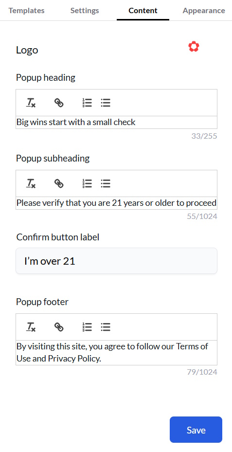
Logo Upload - Click "Upload" to select an image for your logo, which will be displayed in the popup.
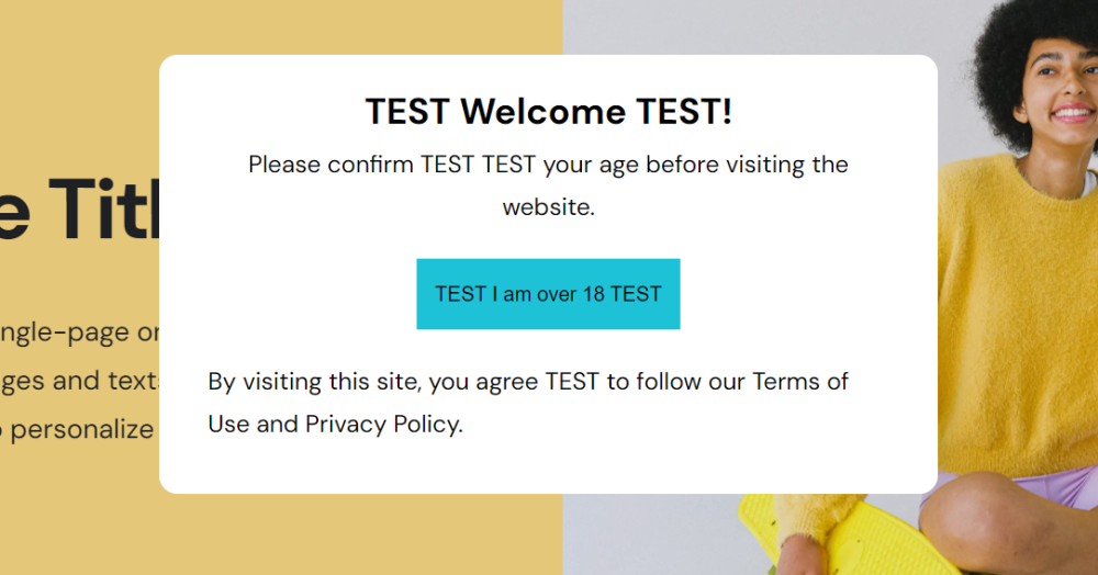
Popup heading - provide customers with a clear and concise headline of the popup when it appears on their screen.
Popup subheading - provide customers with additional context or information to support the main message in the popup.
Confirm button label - specify the text for a confirmations button.
Reject button label - specify the text for rejection button (visible only for the Yes/No verification method).
Note:
The Reject button will not appear on the frontend if the 'Underage action' setting does not have a redirection link configured.
Popup footer - add a section at the bottom of the popup window, typically containing supplementary information, secondary actions, or navigation options.
Click the "Save" button to apply your changes.
Appearance
Open the Appearance tab to customize the popup's look and feel.
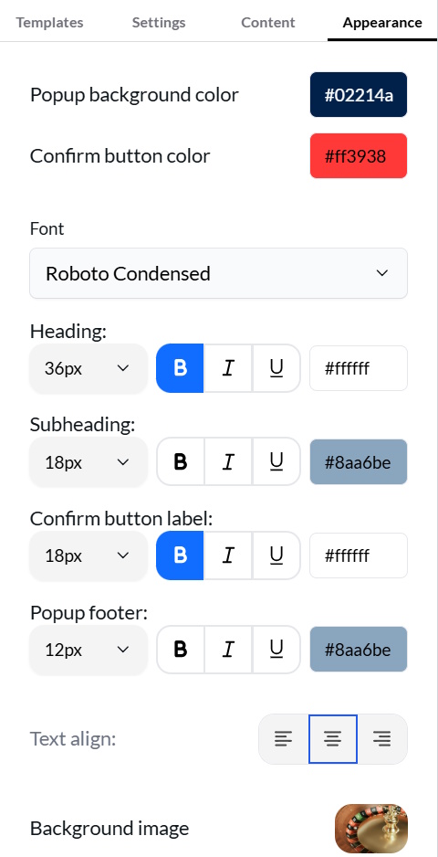
Popup background color - set up a background color of the popup.
Confirm button color - specify the color of the confirmation button.
Reject button color - specify the color of the rejection button.
Font - specify the font of the text in popup.
Next, you can configure the text settings for each element: Heading, Subheading, Confirm Button Label, Reject Button Label, and Popup Footer Text. You can adjust the text size, make it bold or italic, set the text color, and align the text.
Background image - upload an image to be displayed as the background behind the popup.
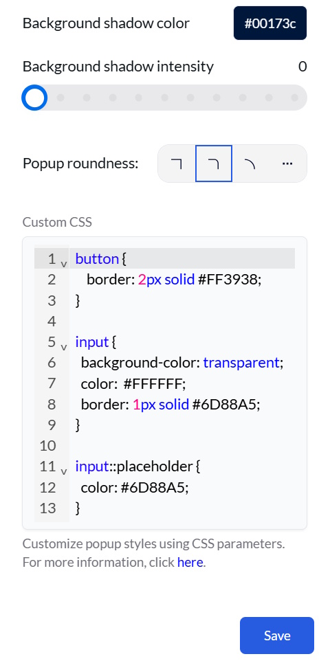
Background shadow color - Choose the color of the shadow surrounding the popup. This setting allows you to create a more visually appealing and integrated look for the popup.
Background shadow intensity - set the intensity of the shadow effect surrounding the popup.
Popup roundness - adjust the shape of the popup by selecting the corner roundness. Click … to set the corner radius.
Note: The maximum allowed radius is 50px.
Custom CSS - For advanced styling, you can use CSS code to customize the popup's appearance. A CSS code input field is provided for this purpose.
After adjusting the settings for the popup, click on the "Save" button to confirm your changes.
To see the preview, look at the right side of the app screen. Changes are displayed immediately.